Album Art as Craft: Building Images That Sound Like the Record
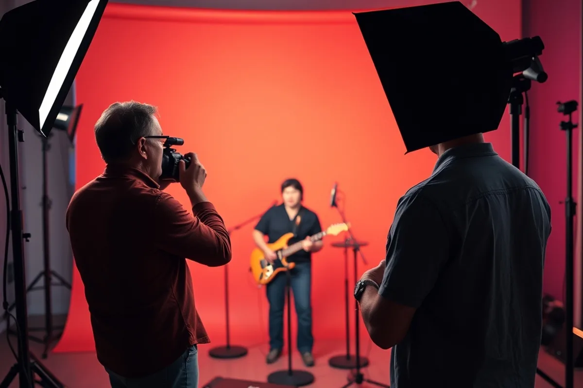
A cover is a translation. It has to suggest the record inside without illustrating it literally, and it has to work at 3000 pixels and at 300. We spoke to designers and photographers about how a strong cover is briefed, shot and finished, and where the process usually goes wrong.
Start from the music, not the mood board
The first meeting should be about the record, not the references. Ask what the artist wants a listener to feel in the first thirty seconds, and what they are afraid the cover will get wrong. Those answers are more useful than a folder of album covers everyone already knows.
Then listen together, ideally in one room with good speakers. Note the tempo, the space in the mix and the emotional arc. A dense, compressed record may need a quieter image; a sparse one may need visual weight. The cover does not have to match the genre, but it should match the experience.
Write a brief that leaves room
A good brief sets constraints without dictating the picture. Specify the format, the release date, the text that must appear and the budget. Then describe the feeling in three adjectives and one sentence. Leave the visual solution open, because the best idea often arrives after the obvious one is rejected.
Agree on the approval path early. Who signs off, how many rounds are included and what counts as a revision? Covers fail when a committee adds opinions late. A short written agreement protects the relationship and gives the designer the confidence to commit to a direction.
Related reading: reading a stage before a live shoot pairs well with Shooting Live Music.
Shoot for the crop
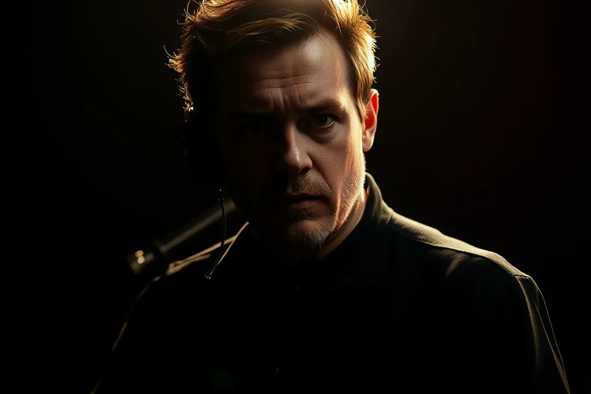
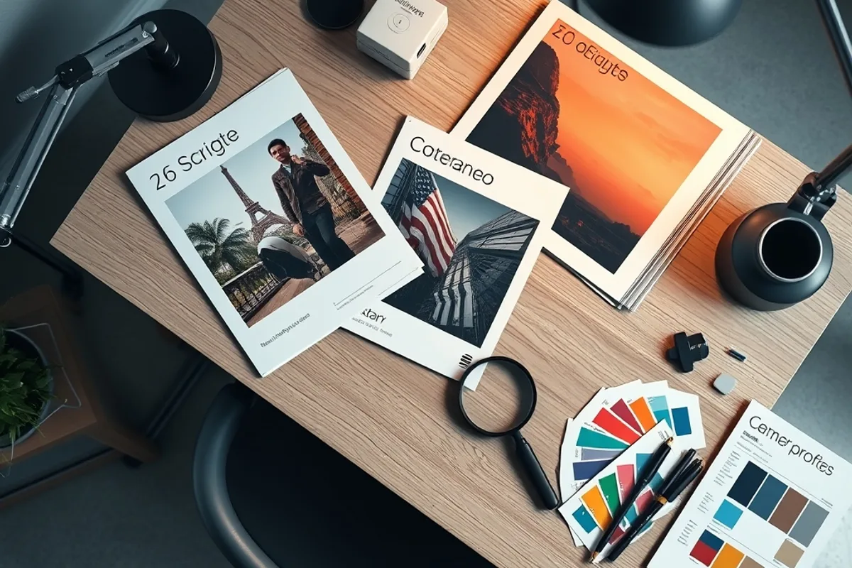
Album art lives in a square, but it also appears as a circle, a thumbnail and a banner. Compose with a safe zone in the centre and check the image at small size before the shoot ends. If the idea only works when the viewer can see a tiny detail, it is probably not a cover.
Lighting should be decided before the day. A single hard source creates graphic shadows that survive compression; soft light can turn to mush at thumbnail size. Bring a reference print or a tablet, and judge the images on something other than the camera screen.
If the idea only works when the viewer can see a tiny detail, it is probably not a cover.
Typography is half the image
The artist name and title must be legible at every size, but they do not have to shout. Choose a typeface that belongs to the visual world of the record, then test it over the busiest part of the image. If it needs a heavy outline or a drop shadow to read, the composition is not finished.
Set the type before final colour grading, not after. The two elements affect each other. A warm image may need cooler type; a busy image may need a quieter placement. Keep the hierarchy obvious: the artist first, the title second, everything else last.
Also see our guide to the vinyl revival and what listeners buy for a deeper comparison.
Colour, texture and reproduction
Covers are reproduced in several ways: streaming thumbnails, vinyl sleeves, CDs and social posts. Work in a colour space that survives all of them, and check the image in greyscale to confirm the composition holds without colour. A cover that depends on one saturated hue will fail on a phone in sunlight.
Texture can add character, but it can also turn into noise. If you scan paper, film grain or fabric, use it at a scale that survives downsampling. Keep a clean master without texture so the label can adapt the artwork for different formats without returning to the original shoot.
Background: the role of album cover design.
The vinyl sleeve test
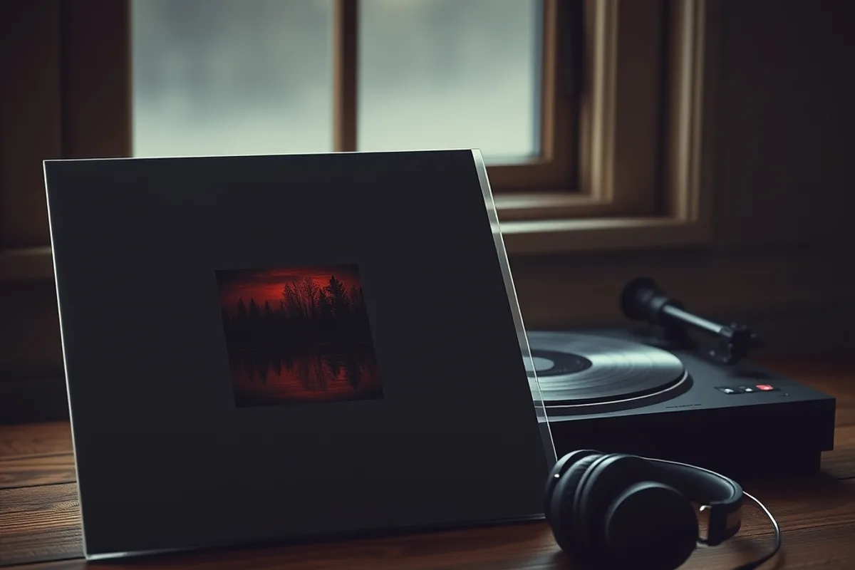
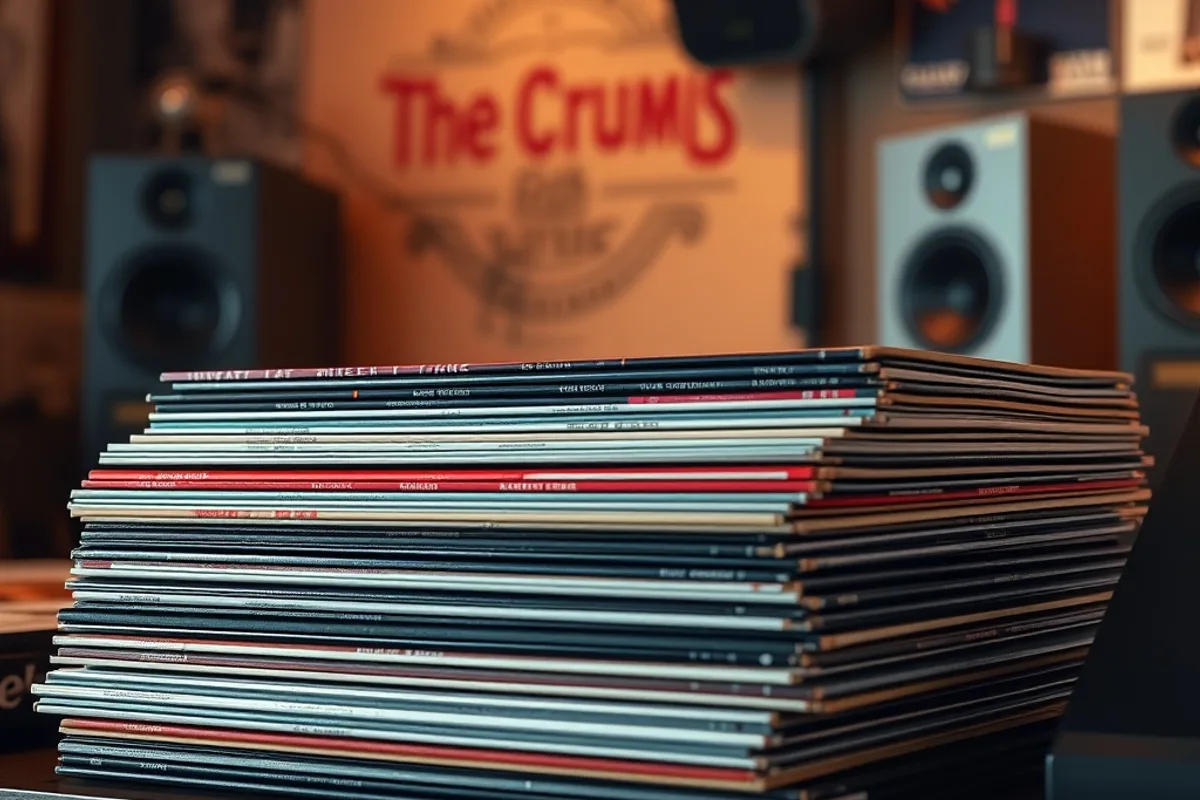
A vinyl sleeve is a physical object with a spine, a back cover and a label. Design the whole package, not just the front square. The spine text has to be readable on a shelf, and the back needs space for the track list, credits and barcode without feeling crowded.
Ask for a physical proof if the budget allows. Colours shift on uncoated board, and dark areas can show scuffing after handling. A proof costs far less than a reprint, and it gives the artist something to hold before the release, which is often the moment the record feels real.
What makes a cover last
The covers people remember usually do one thing clearly. They may be confrontational, mysterious, funny or beautiful, but they are not trying to be four things at once. Restraint is not the same as minimalism; a dense collage can be single-minded if every element serves the same idea.
The final test is recognition. Show the cover to someone for three seconds, hide it, and ask what they remember. If the answer is a colour, a shape or a face, the image has a hook. If the answer is nothing, no amount of clever typography will fix it. Start again with the brief, not the filter.
- Brief the cover from the record's emotional arc, not from a folder of references.
- Compose for a square, a circle and a thumbnail; check the image at small size.
- Set typography before final grading so image and type are judged together.
- Keep a clean master without texture so the label can adapt it for each format.
- A physical proof costs far less than a reprint and catches colour shifts early.

Shooting Live Music: How to Read a Stage Before You Raise the Camera