


Inspired by the visual possibilities of a special meal? Use these four painting studies to help you plan for a finished painting!
Artists have been inspired to paint food and feasts since the beginning, and continue to do so to this day. The colors, textures, and assortments of shapes all work together to make a feast for the eyes. If you’re inspired by the artistic possibilities of a special meal, it can be challenging to organize this abundance of visual information into a cohesive, finished work of art. Here are four painting studies to help you find a vision and plan for a final painting.

Reference Image
This reference image shows a nice table setting and was chosen its potential as a subject for a larger studio piece. If we don’t want to create a direct copy of the photo, we’ll need to decide how I want to interpret it. Each study here allows us to probe the subject to see which visual elements are most compelling.
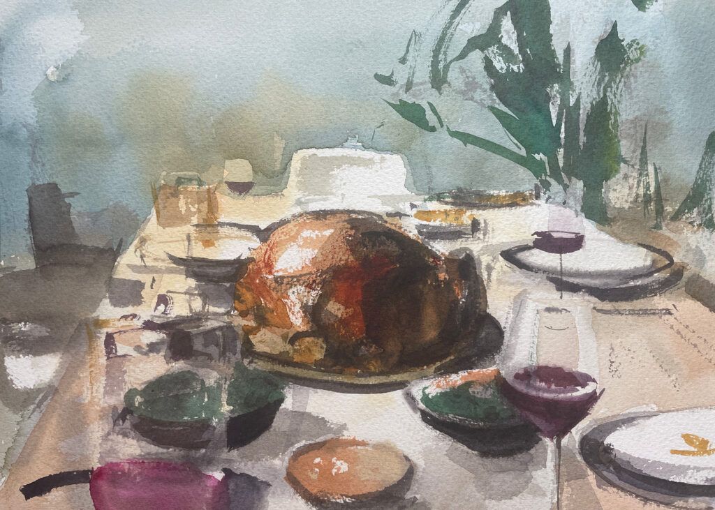
Study #1: Open Exploration
What to do: This first study was painted directly, with quick decisions made as simple reactions to the subject. Throughout the process, some visual elements rise to the surface and the potential of the subject starts to reveal itself. Don’t worry about precision, accuracy, or perspective in this painting.
What I Learned: As a result of this study, some of the elements that become most compelling for me are the textures and edges in this scene. I like the central placement of the turkey. There is also a rhythmic quality to balance of red wine and greens on the table that is visually compelling.
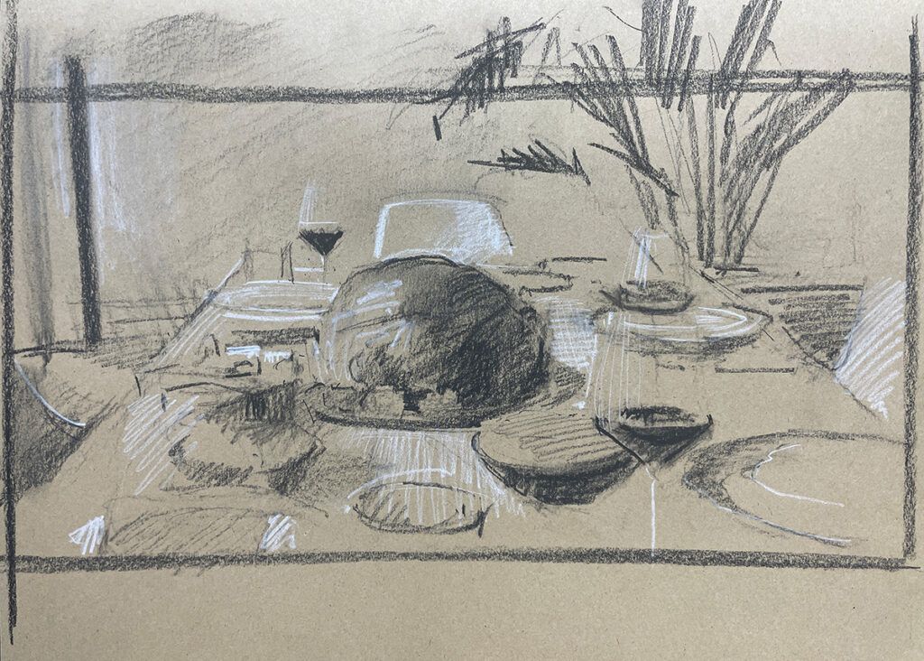
Study #2 Compositional Sketch
What to do: Draw a compositional sketch on toned paper using white and black charcoal to simplify the subject into three basic values. This helps to visualize the overall balance between light and dark. Then crop the drawing to visualize the subject in a different aspect ratio.
What I learned: From this compositional sketch, I can better see that the arrangement of dark shapes on the table create a pleasing distribution of light and dark areas. This study revealed the importance of the background shapes as the fern on the right balances the bookshelf on the left.
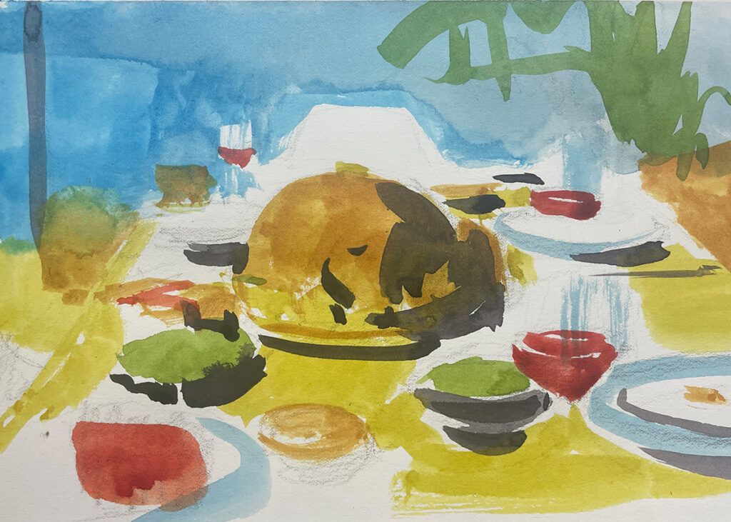
Study #3 Primary Dominant Study
What to do: Create a quick watercolor study that interprets the subject using primary colors. Use blue and yellow as dominant colors for the large shapes and the red for smaller shapes like I did here, or shake up the arrangement for something more creative. Touches of green and orange can add a bit of variety.
What I learned: By exaggerating the colors of the subject in this way, an abstract quality is revealed that is difficult to see in the original photo. A final painting using exaggerated colors like this could make for an interesting abstraction.
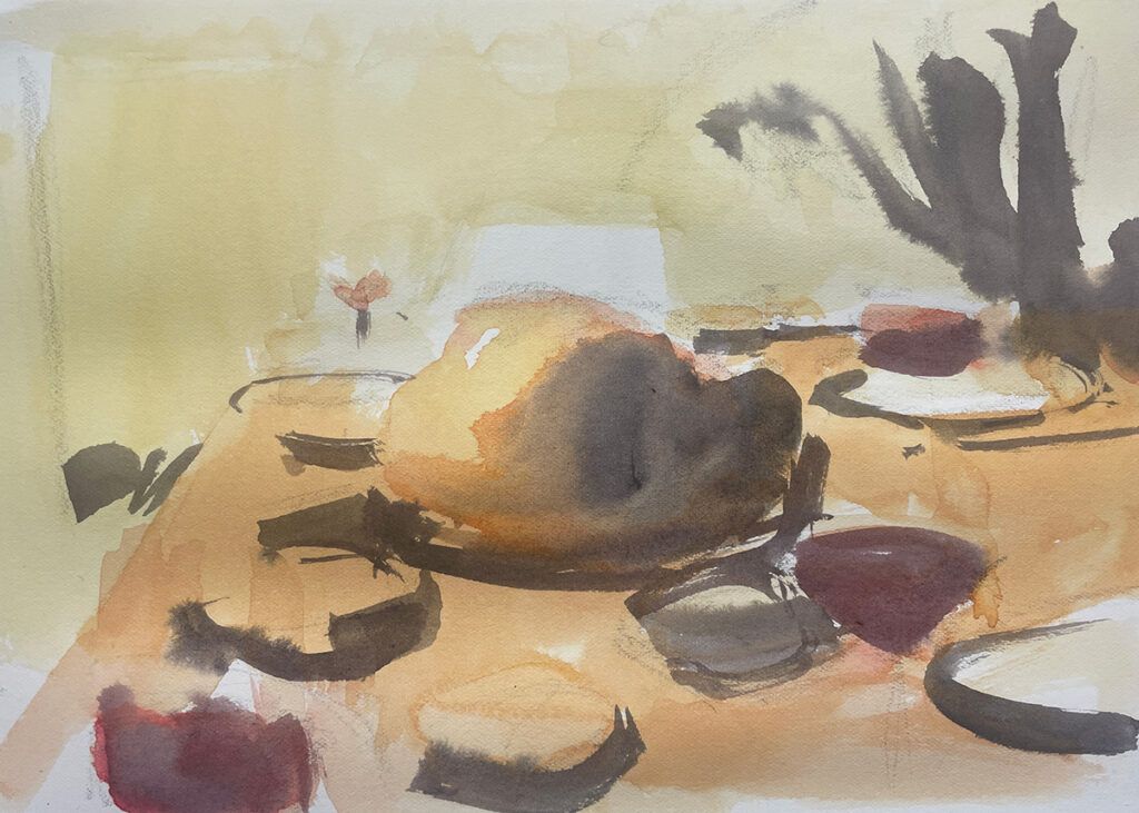
Study #4 Analogous Color Study
What to do: Paint a quick watercolor study using analogous, warm colors. This is another helpful way to visualize the subject and explore new emotional possibilities. Here, I used cadmium yellow, yellow ochre, magenta, and black. Don’t spend too much time with the drawing or any concerns of accurate perspective.
What I learned: The warm color palette suggests a pleasing, calming emotional dimension of the subject. With less color contrast, a final painting using this color palette would rely on value relationships.
What I Learned with these painting studies
The objective of these studies is to reveal the potential for this subject to inform a final painting and provide focus for it. These studies help to visualize a final painting built upon the design established in the compositional sketch, the color approach from the analogous color study, and the loose, expressive quality from the open exploratory study. What direction would you take with this subject? What additional studies would you use?


More Stories
Learning Lines with Line Stations
Ep 120 The AHA Moments we Experience as Artists
Wyatt Kahn “Knots & Figures” at Galerie Eva Presenhuber, Vienna